MISSION STATEMENT:
Mohonk Mountain Lacrosse is a youth organization in New York’s Hudson Valley dedicated to providing a safe, inclusive environment where young athletes of all experience levels can grow their skills and love for the game. Founded in 2024 by a close-knit team of family and friends, the program embodies values of dedication, work ethic, communication, and community. Mohonk Mountain Lacrosse exists to unite players, support their development on and off the field, and strengthen the community through the shared spirit of the sport.
DESIGN INSPIRATION
The visual identity draws from two core influences:
The Sport Itself — Elements of lacrosse equipment informed the form and structure of the logo.
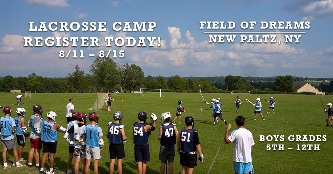
The Location — The organization’s first event was held at the Field of Dreams in New Paltz, NY, overlooking a stunning mountain range. This landscape became a defining visual element in the brand.
Brand Outcome
The final identity reflects the organization’s values—community, dedication, and growth—while grounding the brand in both its sport and its home. The flexible logo system ensures the brand remains recognizable across uniforms, merchandise, digital platforms, and event materials.
LOGO DEVELOPMENT
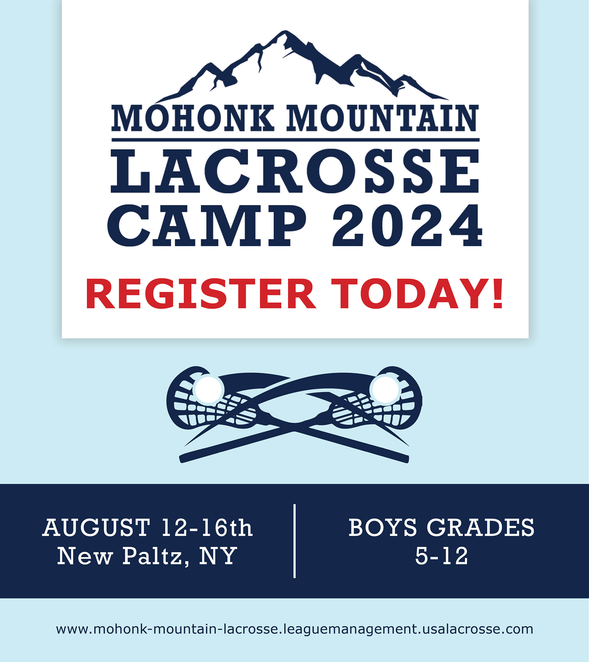
The primary logo blends the energy of lacrosse with the natural beauty of the Hudson Valley. From this foundation, a series of secondary marks were created, including:
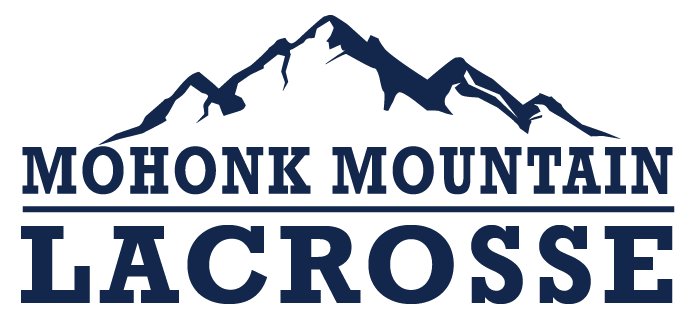
A typography-only logo for clean, minimal applications
A simple mountain icon for small-scale or versatile branding needs
All logo variations feature a flexible color palette ensuring strong visibility, consistency, and adaptability across every environment.
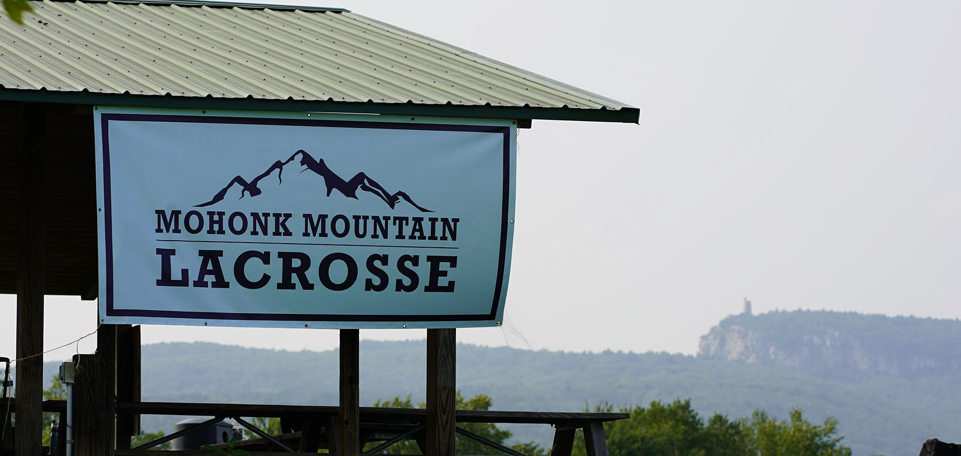
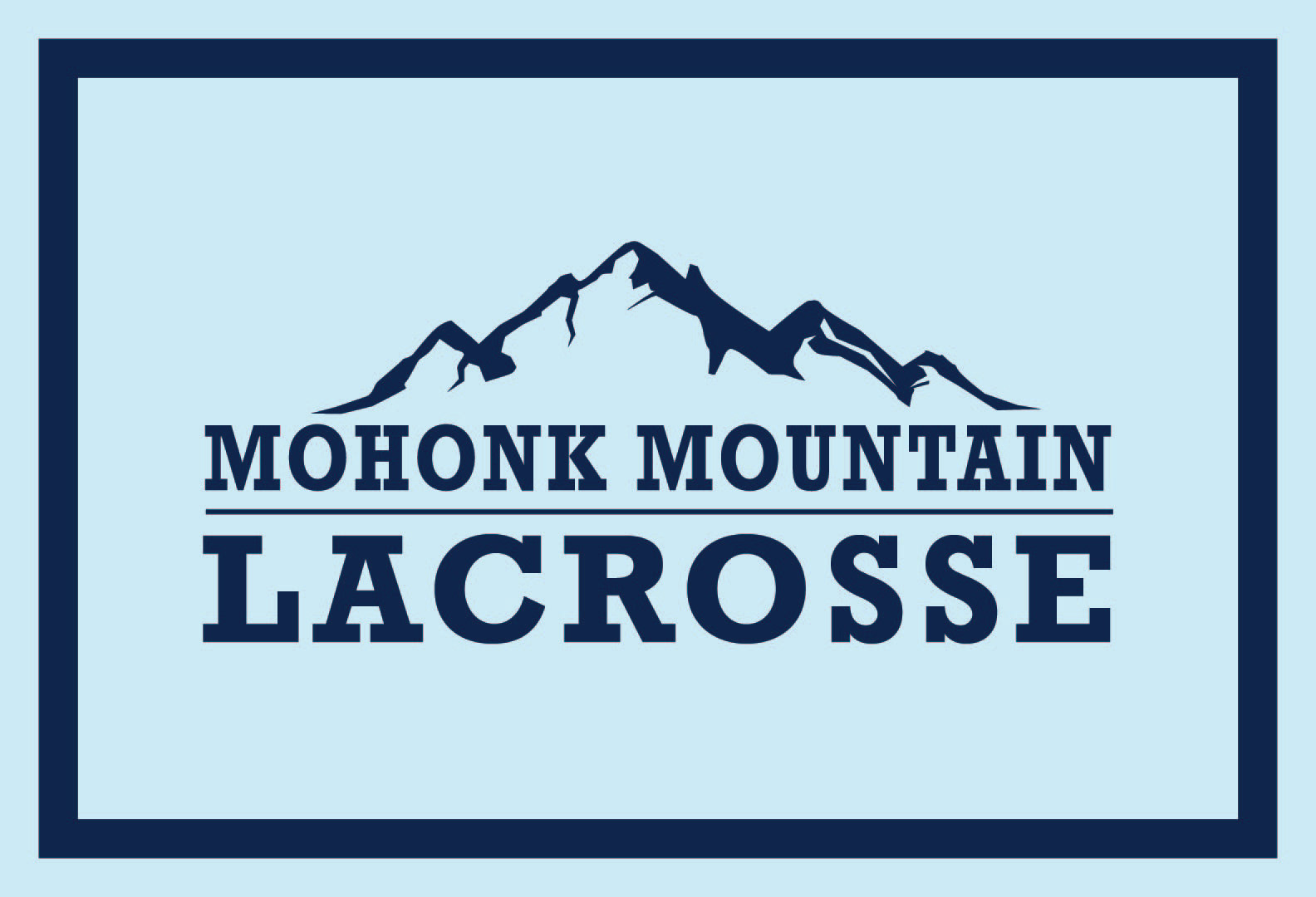
PRIMARY LOGO
Full Color Logo
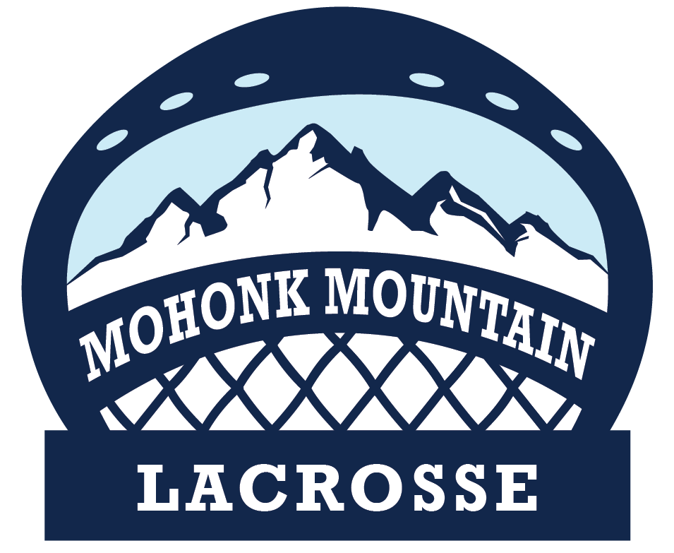
SECONDARY LOGO
One Color Logo
BLANK
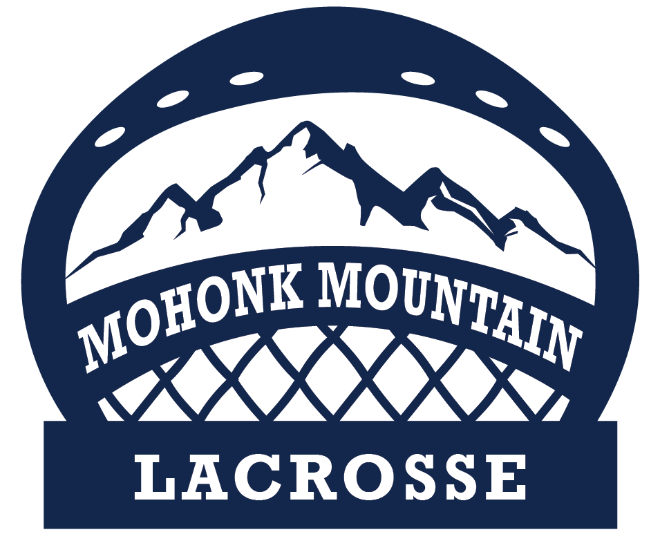
SUBMARK LOGO
Horizontal One Color Logo
WEBSITE DESIGN
Creation of all the different page designs and layouts.
Created sign up pages and layers for people to input information.
Home Page
Home Page Design
Objective
Create a high-impact landing experience that communicates purpose immediately and guides users toward key actions.
Key UX Decisions
Welcome Section:
– Introduces the team and mission using concise, value-driven messaging. This ensures new users instantly understand who the organization is and what we stand for.
– Introduces the team and mission using concise, value-driven messaging. This ensures new users instantly understand who the organization is and what we stand for.
Upcoming Event Highlight:
– By placing an event preview module high on the page it supports task-oriented users, allowing them to access critical information without unnecessary navigation.
– By placing an event preview module high on the page it supports task-oriented users, allowing them to access critical information without unnecessary navigation.
Photo Gallery Integration:
– A visual gallery of past events provides social proof and builds credibility. This section enhances user engagement through imagery that reflects our community and activities.
– A visual gallery of past events provides social proof and builds credibility. This section enhances user engagement through imagery that reflects our community and activities.
Supporting Pages
About Page: Designed to provide depth and narrative, this page outlines the organization's history, coaching team, and long-term goals. The layout emphasizes readability and information hierarchy, guiding users through the story in a structured, user-friendly way.
Event Details Page: Offers comprehensive information on upcoming events using modular content blocks for clarity. This section focuses on scannability, ensuring users can quickly identify logistics, requirements, and schedules.
Sign-Up Page: Built with an emphasis on simplicity and conversion. The form design minimizes user effort through clean layout, clear input labels, and an optimized flow that reduces drop-off.
Past Events Page: Serves as an archive of previous activities, organized for easy browsing. The design allows users to explore historical content without feeling overwhelmed, using consistent patterns from the homepage gallery for familiarity.
Bottom Navigation Buttons:
– By implementing a clear, persistent navigation section at the bottom of the homepage. This helps reduce decision fatigue by offering direct access to deeper content areas without overwhelming the initial vie
– By implementing a clear, persistent navigation section at the bottom of the homepage. This helps reduce decision fatigue by offering direct access to deeper content areas without overwhelming the initial vie
SOCIAL MEDIA
Managed and produced all content, including promotional flyers and Instagram reels for lacrosse programs.
Video Promotion Reel